Visual Rhetorical Analysis
Media and marketing usually choose a specific audience, and, often, that audience is young people. Teenagers are so frequently targeted when it comes to advertising; they are constantly bombarded with ads directed towards adolescents’, with everything from makeup, to food, to acne cream. Marketing goes through drastic measures just to attempt to appeal to the ever-critical teen age group. The four images I have chosen to analyze have that common thread: targeted towards teenagers.
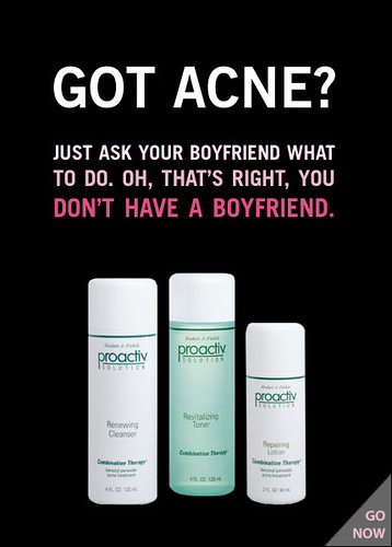
My first image is an advertisement for Proactiv’s acne treatment, a still-image ad used in magazines, billboards, posters, and other similar means of advertising. It shows three bottles of their product against a black background with text overhead. At the top, in all capitalized bold white letters, reads, “Got acne?” while in smaller print underneath reads, “Just ask you boyfriend what to do. Oh, that’s right, you…” Beneath that, in slightly larger and pink font, finishes the sentence with, “Don’t have a boyfriend.” I selected this image because it surprised me with its brash, blunt, and borderline rude message: if you have acne, you must therefore be single. Unlike many other ads, there is no hidden meaning, instead, the ad’s intended message is right in front of your face. Its target audience is teenagers since acne occurs most often in teen years, and consumers this age will likely be more sensitive about lacking a boyfriend/girlfriend. What it means to its audience, specifically teenage girls with acne, is poor skin will cause social problems, such as the inability to obtain a boy/girlfriend, and Proactiv’s product can fix that. The aesthetic composition of this ad helps it be more persuasive and better convey the message. The simple background and plain picture of the product emphasize the text. Furthermore, the white and pink text stand out against the black behind them, and the all capitalized lettering makes for a more harsh and more blunt message. The use of the color pink suggests a female audience, and the pink lettering is further accentuated since it is next to white text; the emphasis put on the pink text is meant to stress above all else the fact that the consumer does not have a boyfriend. The argument presented is that Proactiv’s product can solve the audience’s dilemma; the ad claims their product can erase the user’s acne, therefore enabling them to fix their social problems. This Proactiv advertisement uses the pairing of a subtle visual image and bold text to persuade their targeted teenage audience that their product can solve their acne and acne-caused problems.
The second image I chose is a public service announcement by The Candie’s Foundation, whose goal is to end teen pregnancy. On the left side, it shows a large close-up of Hillary Duff’s face. On the right, there is a picture of a baby bottle and white and pink text against a black background. Above the bottle, in pink capital letters, reads, “You think being in…,” and is finished in white letters reading, “School sucks?” Underneath this, in much smaller white print, are the words, “You know what sucks a whole lot more? A baby- almost every 2 hours for feeding time. And breast feeding isn’t always easy, so if you choose to use formula, you’re looking at about $1,500 a year. Guess school doesn’t such that badly, huh?” I chose this image because of its use of celebrity endorsement to appeal to its target audience. This PSA targets teenage girls; the use of the color pink throughout the ad suggests a female audience, and the mention of school applies to the teenage age group, and talking about breast feeding applies to mothers. The ad is claiming that teenage pregnancy is a difficult lifestyle, and girls should stay in school instead. The public service announcement uses images and text, celebrity endorsement, and aesthetic composition to send its message. Using the image of Hillary Duff helps appeal to the audience by connecting the PSA to a celebrity who generally appeals to teen girls. The use of the baby bottle stirs the thought of baby-raising. The text, “You think being in school sucks?” helps relate to the audience by stating a thought most teenage girls believe. Additionally, the placement of each element portrays the meaning of the PSA. The picture of Hillary Duff takes up a very large portion of the image to stress the celebrity support, and the placement of the Candie’s Foudation website underneath Duff’s picture further suggests that she backs the foundation. The color and font of the text emphasize them against the plain black background to make the message even more prominent. The Candie’s Foundation public service announcement uses celebrity endorsement, a subtle image, and bold text to claim that teenage pregnancy is something to avoid at all costs.
The third image I chose is and advertisement for the Los Angeles City College. It shows an old man delivering a pizza with the quote, “This is my summer job” next to him. Underneath the image, text reads, “Don’t let your present become your future. Enroll now!” I chose this advertisement because of its interesting approach to illustrating what the future of a person who doesn’t attend college could be. Its targeted audience is students graduating high school, since it is encouraging students to attend their college. The ad’s argument is that students who do not attend college may end up with a job and future with less opportunity than those who do; their claim is that attending the Los Angeles City College will give you a different future. By using a large image with a quotation and small but blunt text, the ad conveys this message. The use of the picture with the quote shows an example of a person who never advanced past his “summer job” because he did continue his education. This image is an in-your-face way of telling warning audience of what their future could entail. The text further supports this message and clarifies the picture by explaining the thoughts of the man. The composition of the ad further stresses their claim. By making the picture so large, it is the focal point of the ad. The black capitalized text emphasizes both the man’s dialogue and the message encouraging the audience to “enroll now”. This advertisement for LACC uses a large and obvious image and clarifying and supporting text to claim that their school can provide a better future for its students.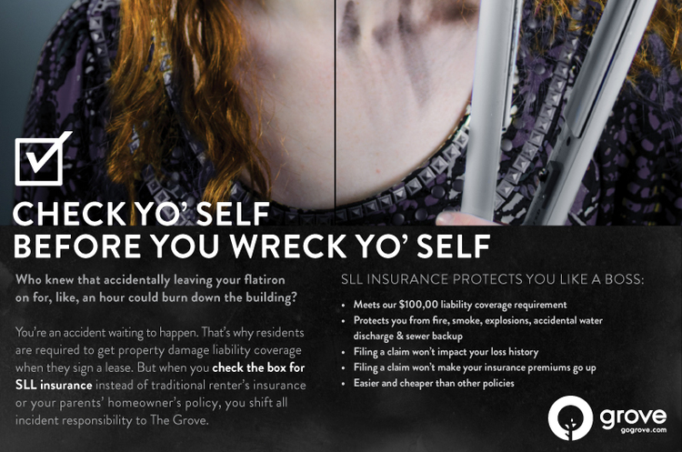
My last image is an advertisement for SLL Insurance. The top half of the still-image is the shoulders and chest of a young woman. The picture is split in half, the left side showing the girl looking normal and healthy, the right showing her holding a flat iron with ash and burn marks on her neck and chest. Underneath this picture are the capitalized large words, “Check yo’self before you wreck yo’self.” Beneath this is a good deal of text giving reasons for investing in SLL insurance. It features the words, “Who knew that accidentally leaving your flatiron on for, like, and hour could burn down the building?”, “You’re and accident waiting to happen,”, and “SLL insurance protects you like a boss.” I chose this image because of its use of slang and causal text to appeal to the young adult age group. The intended audience for this advertisement is teenagers since it uses language generally associated with teens and features the picture of a teen-looking girl. The ad’s argument is that teenagers are accident-prone and thoughtless; their claim is that their insurance will help in teenager-caused accidents. This message is conveyed through a direct visual showing a potential accident that could easily happen to any teen, casual dialogue and slang commonly used by young people, bold and rhythmic text that suggests a self-caused accident, and a list of specific reasons for buying their product. The composition also helps express the message. The picture on top is the focal point, really illustrating the effects of thoughtless accidents and why consumers need this product. The placement of the bold white text underneath draws your eye to it secondly, emphasized by the large font and white color against a dark background. The words in this image both clarify the picture by explaining the situation and what happened to the girl, and support the image by telling the audience why SLL insurance will help in such circumstances. This insurance ad uses the pairing of an image with bold font and clarifying text, as well as relatable language, to claim that their audience of clumsy teenagers and their parents needs their product to protect themselves in teenager-caused accidents.
Overall, all these four images have a common theme of being targeted towards teenagers. Each use text and images to support their claim, and have different methods of appealing to the teen age group. Though each product is very different from the next, they all have a mutual goal of speaking to adolescents.
